|
|
Shoe ad inspiration
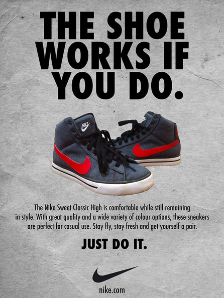
This is an ad promoted by Nike. I chose this ad because the captions throughout the add are well-put together and I found that interesting. Plus, the captions conveys a message that persuades the viewer to buy the shoe. The message has a light, whimsical tone to it which makes it even more likely for people to be interested in this product.
The techniques used to put this ad together seems quite simple. The texts, like mentioned, are persuasive because they are simple yet it catches your attention because it has kind of a whimsical twist to it. The shoes in the photo are probably cropped and edited into the centre. I think the way this product is advertised is not only by promoting the shoe itself, but also adding interesting captions to stand out.
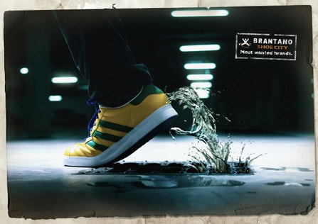
I chose this shoe ad because of the visuals. There is a shoe and behind it, there is water in motion which seems like it's catching onto the shoe. This is a good inspiration for my ad because it captures the idea of motion in good shoes. The fact that the shoe seems like it's in movement along with the water moving along with it is a good way of persuading buyers that this product is flexible and durable.
In terms of the techniques used to put this advertisement together, the main focus on this ad is the water flowing along with the shoe. The water from the sewer is obviously an edit. Adding onto that, the editor made a good choice of colours because the yellow shoe has a good contrast with the blue tones of the water and the blue-toned floor.
In terms of the techniques used to put this advertisement together, the main focus on this ad is the water flowing along with the shoe. The water from the sewer is obviously an edit. Adding onto that, the editor made a good choice of colours because the yellow shoe has a good contrast with the blue tones of the water and the blue-toned floor.
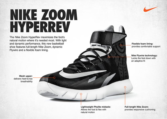
This is another advertisement by Nike. I chose this photo because I found the idea of putting captions about the parts and functions of the interesting. And just like this ad, I am also inspired to put captions of the functions of each part of the shoe I am advertising.
Yet again (just like the first Nike ad), the editing done to put this ad together seems quite simple. The shoe is placed over a plain background, and shadows were added around the shoe to achieve a more realistic 3-dimensional effect. Then a bunch of text were added in various parts of the shoe.
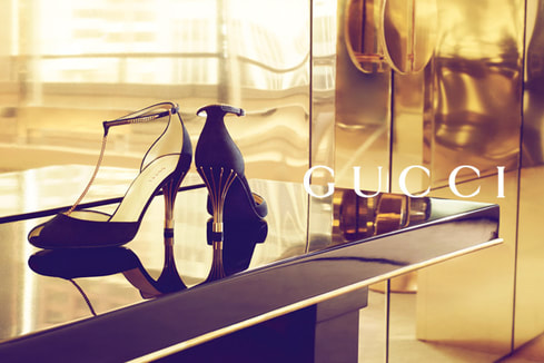
This is a Gucci advertisement advertising a pair of black heels with gold embellishments. I chose this ad because the gold background and the shoes itself really captured my attention (since gold is one of my favourite colours). And I also like that the gold is clear and glossy. This ad inspires me to also set up a a similar clear, glossy background, whether it would be gold, bronze, or any other colour, as long as it has a shine to it.
Although this is a fairly simple-looking ad, I think a lot of thought went into this. Firstly, the product. Black and gold go well together, and that type of look is achieve in this ad through the black heels with gold detailing, plus the gold background. Adding onto that, of course the product that is being advertised needs to be shown properly, so the editor/photographer decided to put the product on a glassy surface in order for the viewer to see the shoe from different angles. And lastly, there's the gold itself. The photographer knew that gold is a beautiful colour and it catches the eye. So they set up a gold background and put gold detailing on the pair of shoes to make it more elegant.
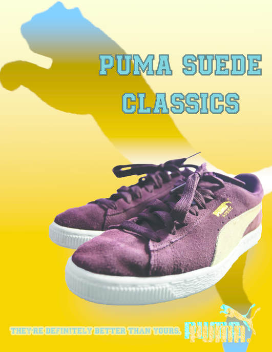
A puma ad way better than yours ;)
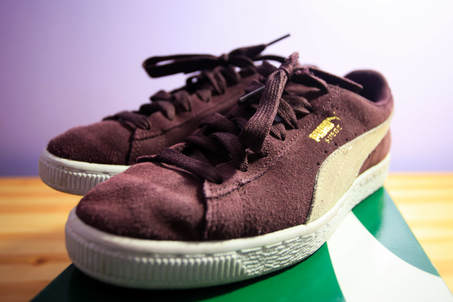
This is a knockoff I made of the advertisement for Puma's Suede Classics (which I think looks better than the original one because that one's boring and mine looks more fun). There are quite a few things I like about this ad. Firstly, I love the idea of having a funny slogan. So I came up with a really obnoxious but funny slogan that can be considerably persuasive. Also, I had the idea to do something different with the Puma logo. So what I did was first I took a Puma logo from the internet, and I cropped the background so that there would only be the Puma logo without the white background. Then I got the idea to do a gold logo, so I made the logo golden-yellow and I added texture to make it look like actual gold. After it was already perfect the way it is, I decided to duplicate the logo and make a blue one to contrast the gold. I overlapped the gold on top of the blue.
|
|
THE GLOW UP
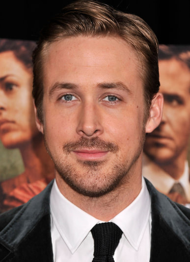
BEFORE |
AFTER |
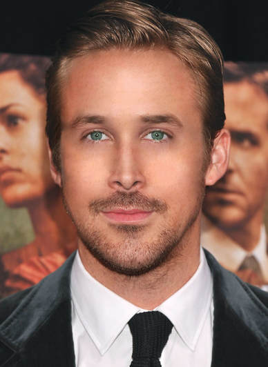
These are the before and after pictures of an edit of Ryan Gosling. First, I made his face as symmetrical as possible, so I used the marquee tool to clone his left eye to match with the right, the right side of his nose to match the left, and the right side of his lip. Then I took away his skin blemishes and made his skin clearer by using the healing brush and liquify. Then I did his face contour. I used the burn tool to darken the sides of his face and forehead, and the sides of his nose. After that, I added highlight to the tip of his nose, the nose bridge, the forehead, and cheeks. Lastly, I made a subtle change to his eye colour. I made his eyes lighten and more green, and I used the burn tool again to darken his pupils.
Not my puppies but that's okay
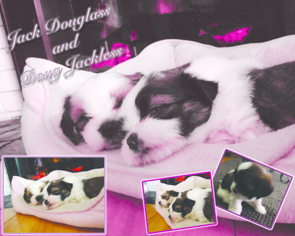
"Who cares if they're not my dogs? I'm taking their pictures anyway!" says me when I took these photos after desperately finding an animal that actually fits the week's shooting assignment theme. No, these are not my puppies. I had to go to my mom's friend's house to take pictures of these puppies because I didn't have pets prior to this shooting assignment. I was inspired to do a pink-themed collage because it just seemed fitting to do something pink-themed for newly born baby puppies. Also, the names "Jack Douglass" and "Doug Jackless" are not their real names. I came up with the names myself and I thought it was funny.
