CANADA 150 WEEK
Hockey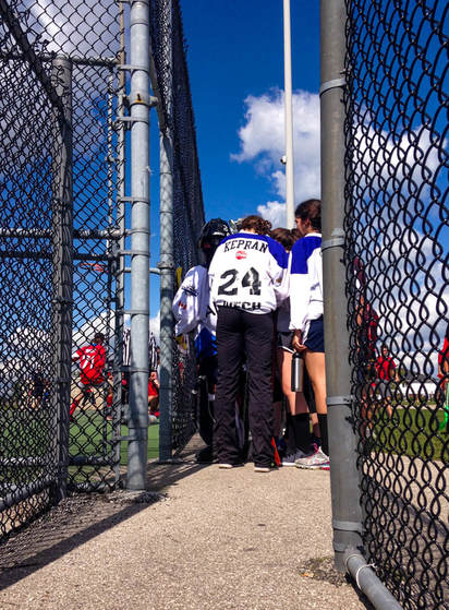
|
Hockey is a sport Canada is very known for, which is why I captured a picture of these hockey players waiting for their turn on the field. This is a well-captured image because there is a clear view of the composition that makes up the image. This image shows a greater depth of field, and it shows the foreground (the fences nearest to the camera), middle-ground (the players wearing blue and white), and the background (the people wearing red and white, the pole). Connecting onto that, there are lines that connects together and leads the eye around the photo (for example, the gray metal pole nearest to the camera goes up and connects to the white pole leading to the subject, which are the players). Also consider the colours. There are lots of blues, whites, and grays in this photo that are analogous and go well together. Also the high contrast of the reds and whites. The main goal I wanted to achieve in editing this photo was to make the colours more vibrant and have a better crop. Originally, this photo was taken from further away and it was just bland. So I cropped the image smaller so the subject would appear nearer. I didn't do much with lens correction other than making the scale of the image slightly bigger and rotating the image for adjustments. I did white balance, and adjusted the contrast, highlights, shadows, and whites to a higher setting. And I also toned the blacks and exposure down a little bit to complement the other adjustments. |
|
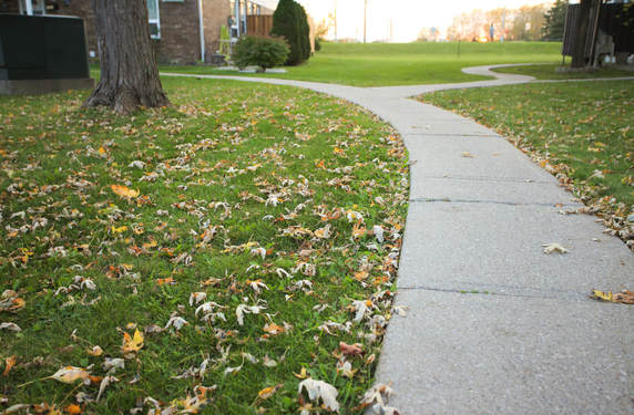
The leading lines in this photo, specifically the lines that make up the pavement, reminds me of the distance that Terry Fox walked. If you look at the pavement closely, its leading lines create an illusion of going onto the far distance. There is also great contrast in this photo such as the complementary greens and reds, and the contrast between reds and whites. Again, I didn't do much with the lens correction except for a little bit of rotation to position the image properly. I did white balance and this time the temperature of the photo is more on the yellow side. I increased the vibrancy of this photo quite a bit in order for the complementary colours to be in great contrast. |
Terry Fox Walk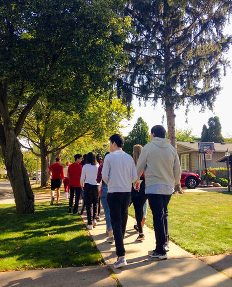
|
Canada 150 Activities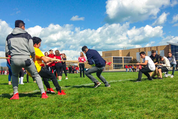
|
This is an image of people playing tug of war during the Canada 150 activities. This is another image where there is visible composition. The people pulling the rope are in the foreground, the girls wearing red are in the middle-ground, and the background would be the rest of the people at the very back and the school. This time though, this image is leaning towards a more shallow depth of field. Once again there are lines, specifically the rope. The rope is a very prominent line because it leads to the direction where the main activity is happening. In terms of editing, I only did a few tweaks to the photo in order to make it look better. I cropped the photo so that the the ground has a symmetrical space with the sky, and I did so too with the sides. I did my white balance, and this time it is more neutral to green-toned. I didn't do much with the exposure, contrast, and lens correction because it was already perfect the way it is. So I only adjusted the highlights and whites into a lower setting so the pictures won't be overexposed, and I adjusted the shadows and blacks into a higher setting because the picture itself was already light enough. I also tweaked the saturation and clarity of the image a little bit, and I especially wanted to make the colours in the photo more vibrant so there would be high contrasts between complementary colours. |
THANKSGIVING
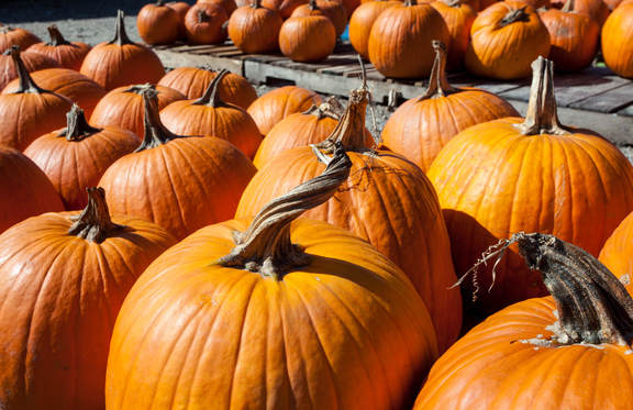
Pumpkins are a big part of thanksgiving and it perfectly symbolizes the season of fall and thanksgiving. I took this picture when my family and I, along with some friends, went pumpkin picking.
I adjusted the white balance of this photo by using the medium toned grays in the wood which the pumpkins are sitting on. I also adjusted the shadows, whites, clarity, and vibrancy of this photo on a higher setting, and the highlights and blacks on a lower setting. I did not do much with the exposure, contrast, and lens settings.
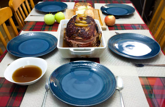
This is a picture of the dinner my family and I had at thanksgiving. This is an important aspect of thanksgiving because it shows that we are thankful for the blessings we have and we celebrate thanksgiving by using those blessings.
I adjusted the white balance of this image by using the medium gray shade on the fork on the right. I also adjusted the highlights and whites on a higher setting, and the shadows and blacks in a lower setting. I added a lot of vibrancy and a little bit of saturation to this photo. And I didn't do much with the exposure, contrast, clarity, and lens corrections.
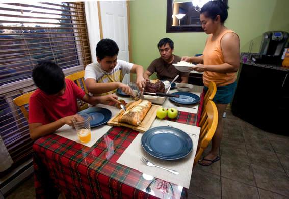
This is my family at thanksgiving dinner. This is also an important aspect of thanksgiving because it shows togetherness.
Once again, I did my white balance, and I didn't do much with the exposure, contrast, and lens correction. But I bumped up the highlights, shadows, and whites, and I lowered down the blacks. Along with that, I adjusted the clarity, vibrancy, and saturation of the photo to make the colours more visible and not too bland-looking.
SHADOWS
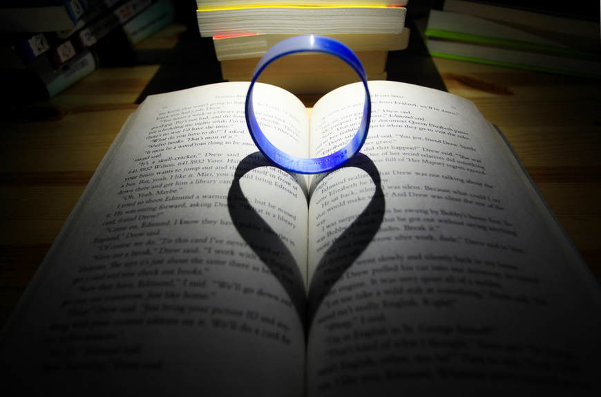
This is a heart-shaped shadow. There is a light source about the circular bracelet that created an illusion of a heart-shaped shadow when placed at a certain angle. Since I was in a dark room, I increased my ISO to 800, I set my aperture to f/5, and I set my shutter speed to 1/30th of a second. In terms of editing, I increased the highlights, shadows, and blacks. After that, I decreased the clarity of the photo because the edges were too sharp.
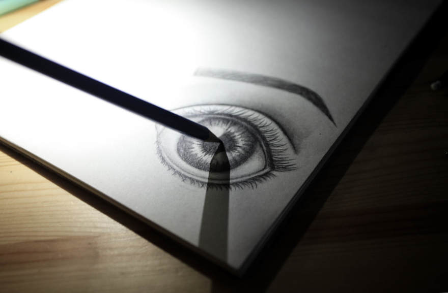
This is a shadow of a pencil I used to draw this eye. I got the idea of including one of my personal drawings and creating a shadow out of a pencil I used to draw this eye to symbolize this is my own drawing. Once again, the room I took this picture from is very dark, so my ISO is at 800, my aperture is is f/4.5, and my shutter speed is 1/13th of a second. For the editing, I decided to decrease the saturation and vibrancy of the photo, and in balance to that, I decreased the shadows, whites, and blacks to soften the image.
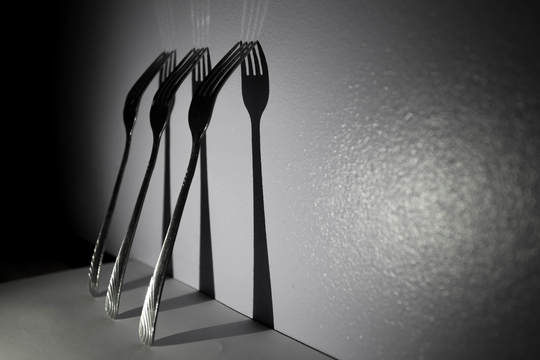
This is an image of shadow forks. Once again, my ISO is at 800 because the room is very dark, my aperture is at f/5, and my shutter speed is 1/20th of a second. Like the previous picture, I decided to decease the saturation and vibrancy of this photo because the lavender colour of my room is quite distracting. I made sure to increase the highlights and whites so the shine on the forks would be visible, and in balance to that, I decreased the shadows and blacks for the shadows of the fork to show.
AUTUMN 2017
This is an image of fallen leaves from the front of my house. I took this image because it is one of the main aspects of autumn; leaves falling onto the ground. I didn't do much editing to this photo because it was already well put together. But I fixed the white balance, and I increased exposure, contrast, vibrancy, and saturation of the photo so that it would have more colour and light.
|
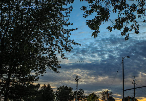
This is an image of the sky during the sunset. I took this picture because autumn is a time when it gets darker outside at an earlier time. I did a lot to this photo, mainly tried to bring out the dark blue colour of the sky in contrast with the sunset. So in order for the colour to stand out, I increased the temperature, saturation, and vibrancy. And I really wanted the clouds to be more defined, so I decreased the exposure, and I increased the contrast, shadows, blacks, and clarity. |
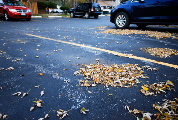
This is a picture of several piles of leaves in the parking space near my house. I took this picture because leaf piles signifies the collection of the fallen leaves in autumn. Just like the previous photo, I wanted the contrast between the blues and the yellows in this photo to be visible. So in order to do so, I increased the temperature, contrast, vibrancy, and saturation of the photo. But then the colours got too dark and there wasn't really much of a contrast anymore, so I decreased the blacks and shadows, and increased the highlights.
HALLOWEEN
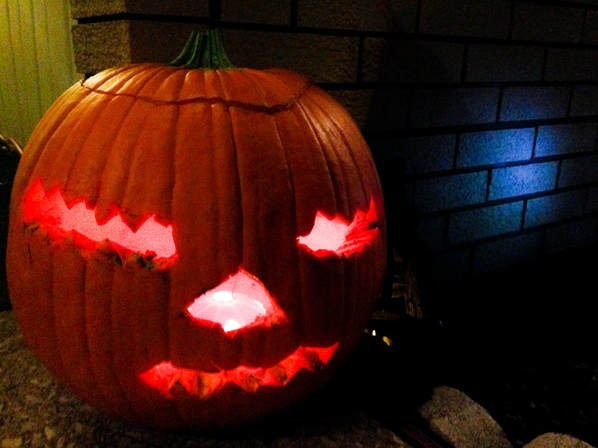
This is a picture I took of a pumpkin while I was trick-or-treating with my friend. I took this picture because it is one of the main elements of Halloween. Since I took all of my pictures using my iPhone, I can only rely on the editing to make the photo more interesting. So since I didn't have much to work with, I picked this photo in particular because there is contrast, the orange pumpkin and blue brick wall are complementary (along with the yellow wall behind the pumpkin). Also, the yellow wall and the pumpkin go well together because they are analogous. In terms of editing, I mainly focused on making the colours more vibrant, so I increased the vibrancy and saturation, and I increased the shadows and blacks to add depth within the composition of the photo. But since it got too dark, I increased the highlights and whites a little bit.
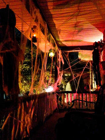
This is a picture of my friend's house during Halloween. This photo is very relevant for the theme of Halloween because people decorate their houses with spooky props to get into the Halloween spirit. I didn't do much drastic editing, although I did make the photo a little bit brighter since it was quite dark. So I increased especially the whites and a tiny bit more contrast, lessened the shadows, and added more blackness.
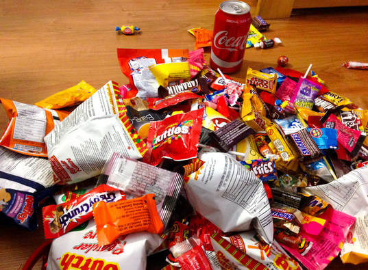
This is a picture of the treats I got after trick-or-treating. I took this picture because one of the things that symbolizes Halloween is candy. I didn't do much editing to this photo because it was already well took. I only lightened the photo because I wanted to add highlights to the candies since it is the main focus. So I increased the whites and highlights and decreased the blacks, along with that I also added vibrancy and saturation so the colours would be more prominent.
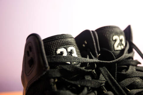
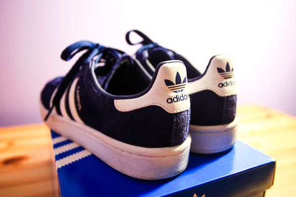
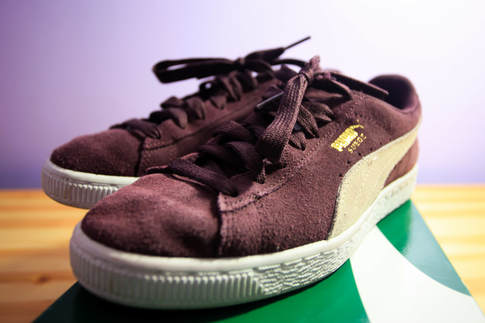
What are thooooooose?!
(If you don't get this reference then i don't get why you don't get it)
|
|
|
Here are a bunch of shoes I stole from my brother and my mom (except for that one on the bottom left, that's mine). This photos were taken when I was experimenting with camera angles and I'd say my favourite one is the one on the top left. I like it because the shoes closest to the camera is clear and in focus while the one next to it that is farther away from the camera is blurry (which brings the focus to the other shoe). Also, I like that the detailing embedded on the shoe is very visible.
I edited these photos like how I want them to be in my shoe advertisement assignment. I made sure to really bring out the colour in the shoes and make the detailing more prominent. So I played around with the highlight and whites adjustment to lighten the image, but also payed attention to the contrast so that the shoes wouldn't be too dull-looking. |
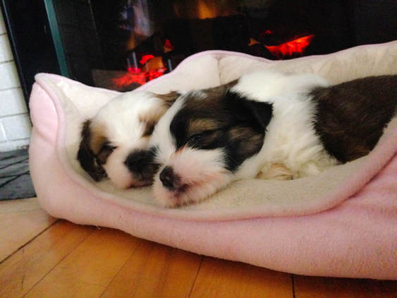
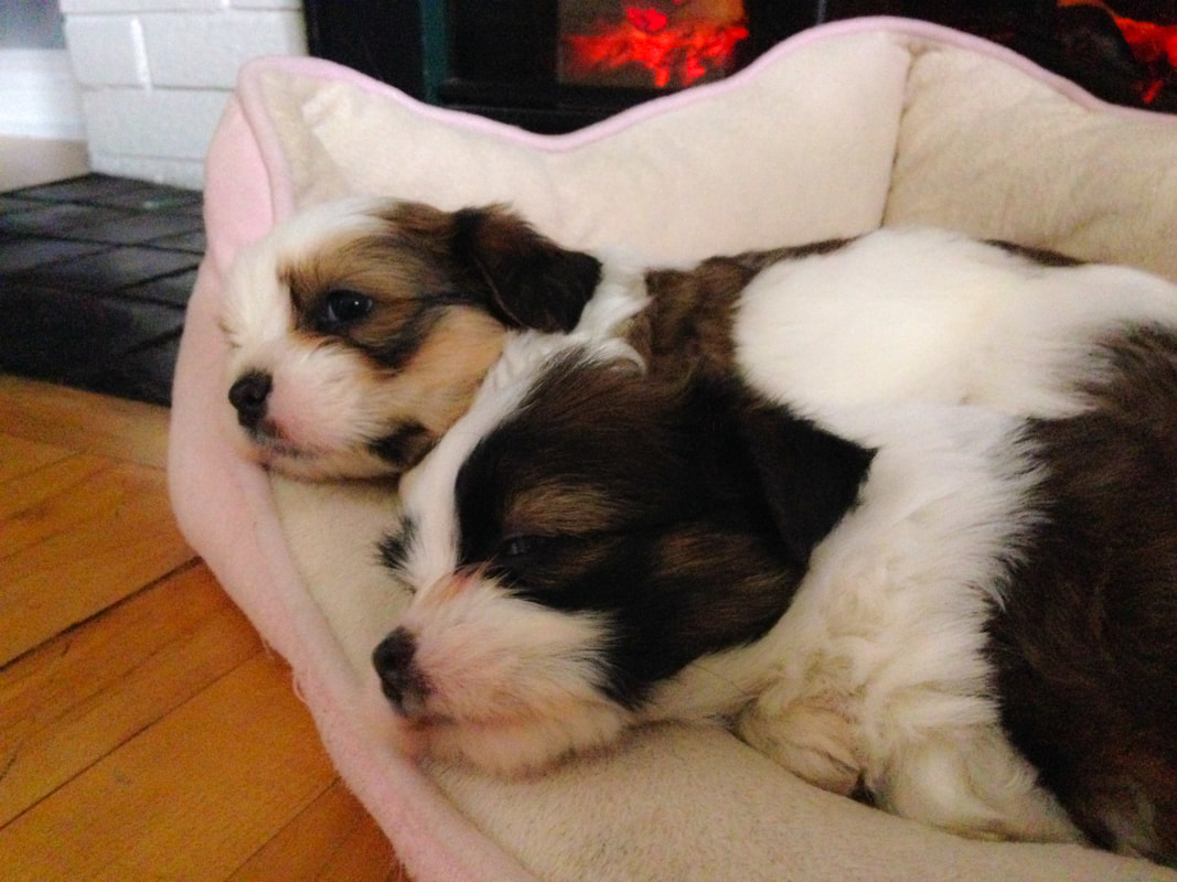
Not my doggos
|
|
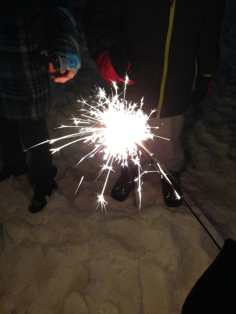
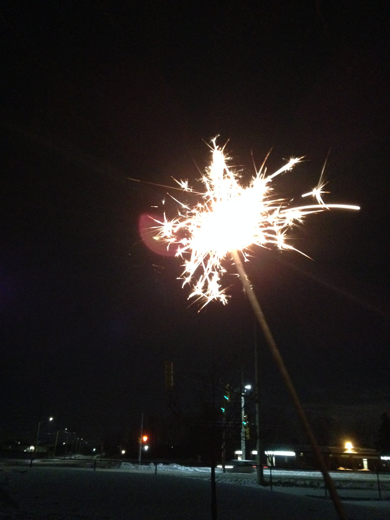
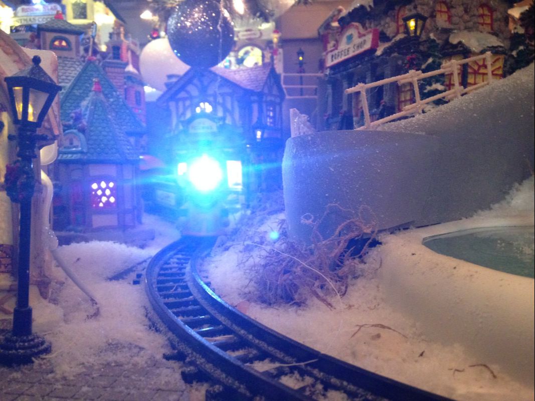
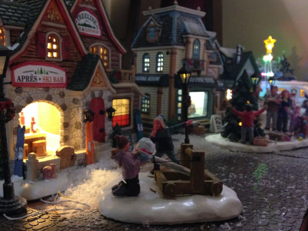
CHRISTMAS 2017 AND NEW YEAR 2018
|
|
|
|